How the Windows 95 Start Button Changed Computing Forever
April 15, 2026
If you use a computer today, your workflow probably starts in the bottom left corner of your screen. Whether you are on a modern PC or a Mac, the concept of a dock or a taskbar is second nature. But before August 1995, using a PC felt like trying to organize a desk that was constantly being hit by a leaf blower.
Windows 3.1, the predecessor to Windows 95, did not have a Start menu. It did not have a taskbar. Instead, it used something called Program Manager. It was essentially a series of windows inside other windows. If you minimized a program, it turned into a tiny icon that sat on your wallpaper. Finding your files required digging through layers of File Manager without a central search or menu to guide you. It was powerful, but it was not intuitive.
The Marketing Event of the Century
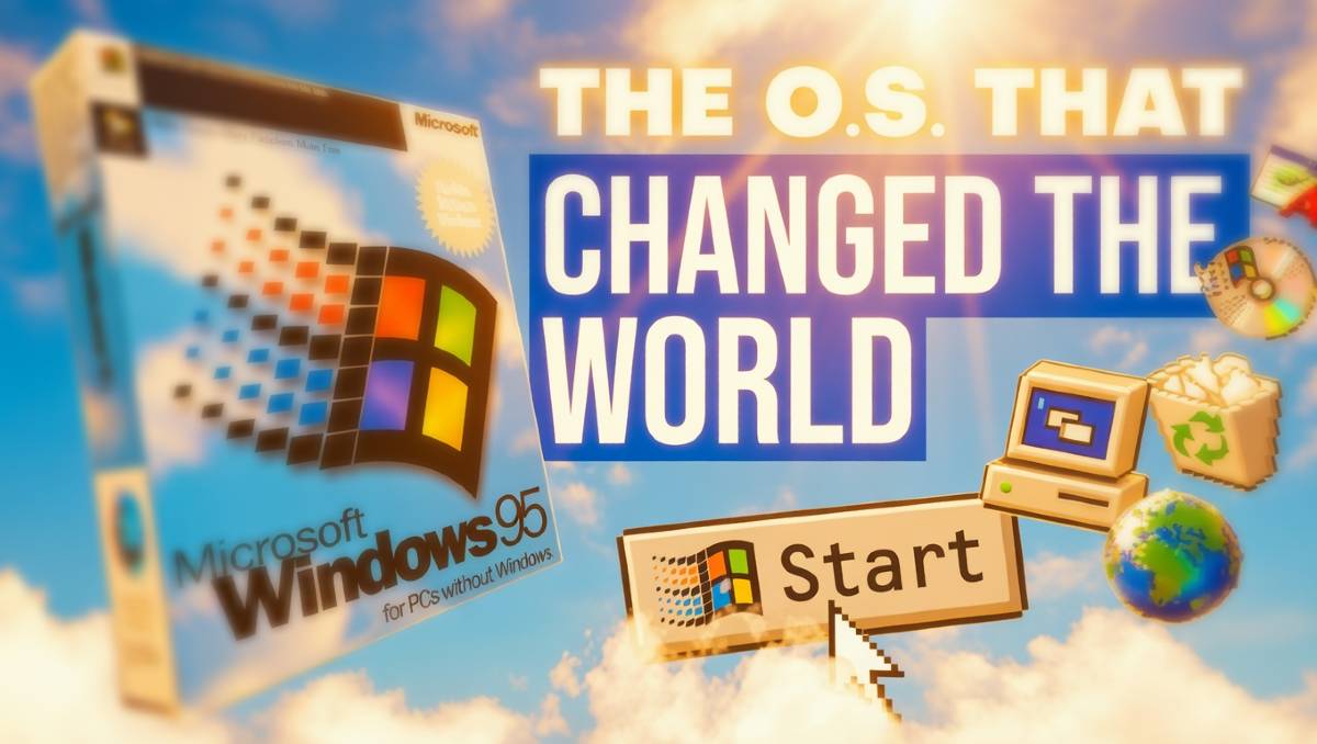
Microsoft knew they had to make the PC accessible to everyone, not just tech enthusiasts. On August 24, 1995, they launched Windows 95 with a marketing campaign that was unprecedented for software. They paid millions of dollars to use the Rolling Stones song "Start Me Up" and even hired Jennifer Aniston and Matthew Perry to star in a cyber sitcom instructional video.
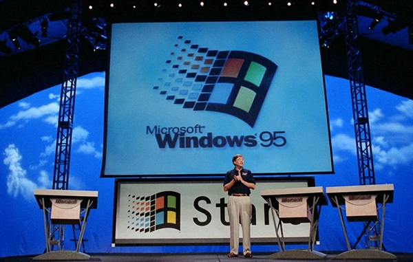
The centerpiece of this entire campaign was the Start button. It was designed to answer the most basic question a new user had: "Where do I begin?" By putting everything into one single, organized menu, Microsoft turned the computer from a specialized tool into a household appliance.
The Three Pillars of the Desktop
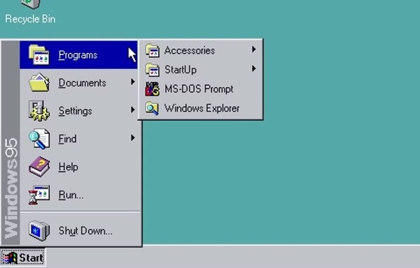
Windows 95 introduced the three elements that still define our digital lives today. First was the Start Menu, which acted as a central hub for every app and setting on the machine. Second was the Taskbar, which finally gave users a way to see which programs were open at a single glance.
Third was the Desktop as we know it. Before 95, you could not really put files on your desktop because it was just a background for icons. Windows 95 introduced the Recycle Bin and My Computer, turning the screen into a literal digital workspace where you could drag and drop files.
A Design That Refused to Die
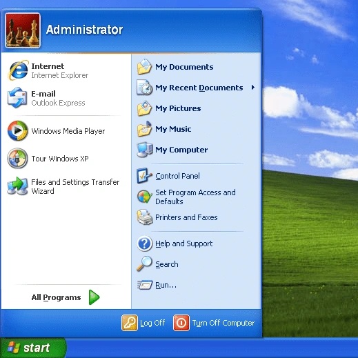
The design of the Start menu was so effective that it became the standard for every operating system that followed. It stayed largely the same through Windows 98, ME, and 2000. When Windows XP arrived in 2001, Microsoft updated the look with a two-column layout, but the core logic remained identical.
Microsoft learned just how iconic this design was when they tried to remove it. In 2012, Windows 8 launched without a Start button, replacing it with a full-screen Start Screen made of tiles. The backlash from users was so intense that Microsoft was forced to bring the button back in Windows 10. It turns out that after decades of clicking that bottom-left corner, our muscle memory is permanent.
Experience the Evolution
While Windows 95 was the foundation, it was Windows XP that truly perfected the Start experience for the internet age. It took the stability of the new millennium and combined it with the user-friendly design that began in 1995.
At Quenq, we preserve these digital milestones so you can see how far we have come. If you want to experience the peak of the Start era, you can jump into our online Windows XP simulator and see how that 1995 invention evolved into the most famous interface in history.
Click here to launch the Reborn XP simulator and explore the classic Start menu.